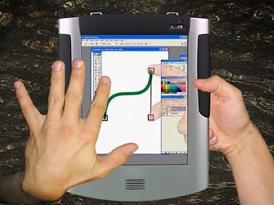
 Now, after a long time (when we first laid our eyes on the LucidTouch prototype from Microsoft back in October), Microsoft has unveiled some artist mock-ups of what the device could look like as a final product.
When compared to the prototype, is readily apparent that they have a long way to go (especially with that bulky camera), but at least it is still an ongoing project. Whether users will prefer the UI to a traditional touchscreen remains to be seen.
Source- http://gizmodo.com/367180/microsofts-lucidtouch-transparent-touchscreen-device-gets-all-mocked-up
 Unknown
 Thursday, March 13, 2008


No comments:
Post a Comment